


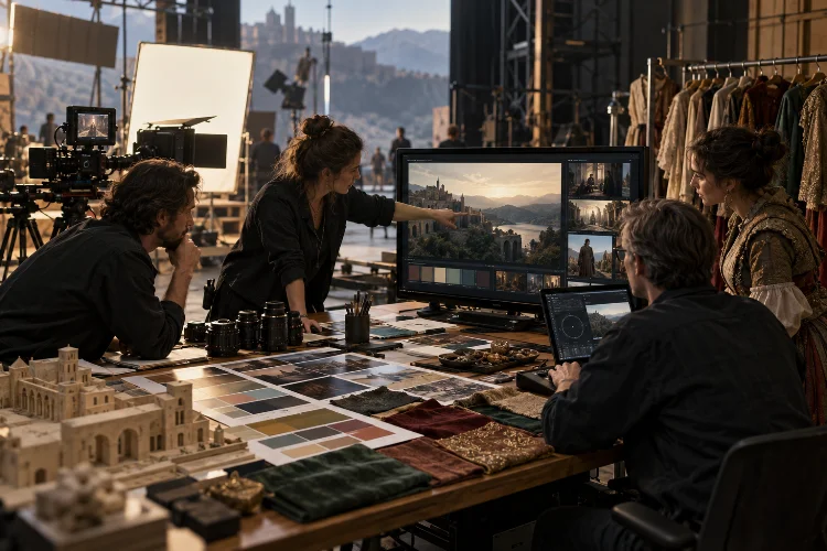
A feature film may be shot across dozens of locations, over several months, with different weather conditions, sets, cameras, costumes, and sometimes multiple production units.
Yet when the finished movie reaches the screen, ideally it should feel like one coherent visual experience. That consistency does not happen automatically.
Understanding how filmmakers build visual consistency across complex feature films means looking at the collaboration between directors, cinematographers, production designers, costume teams, camera crews, digital imaging technicians, editors, and colorists.
Each department controls a different part of the image, but all of them need to support the same visual language.
The challenge becomes even greater when a movie contains multiple timelines, countries, dream sequences, or radically different environments. Filmmakers may want those sections to look distinct without making them feel as if they belong to completely different movies.
The solution is not making every shot identical. Strong visual consistency comes from establishing recognizable rules – and knowing exactly when the story gives you permission to break them.
Visual Consistency Starts Before the Camera Rolls
The visual identity of a movie usually begins during pre-production.
The director and cinematographer discuss how the story should feel visually. They may collect photography, paintings, films, architecture, colors, textures, or other references into look books and mood boards.
These references help answer practical questions.
Should the camera feel controlled or spontaneous? Should faces appear naturalistic or sculpted by dramatic lighting? Will the movie favor warm colors, desaturated tones, strong contrast, or softer images?
Once those principles are established, other departments can work from the same foundation.
The production designer can choose sets and materials that support the palette. Costume designers can avoid colors that clash with locations. The cinematographer can select lenses, filtration, lighting, and exposure methods that reinforce the intended mood.
The real advantage is alignment.
Without an agreed visual direction, every department may make attractive decisions individually while accidentally creating a film that feels visually fragmented.
Lens Choices Create a Consistent Visual Perspective
Lenses do much more than determine how wide or close a shot appears.
They influence perspective, facial rendering, depth, background separation, distortion, flare, contrast, and the overall texture of an image.
That makes lens selection one of the easiest ways to establish visual consistency.
A cinematographer might build most of a movie around a limited set of focal lengths. Perhaps intimate conversations regularly use 40mm and 50mm lenses, while wider environmental shots favor 27mm or 32mm.
Those choices create patterns the audience can feel even if viewers cannot identify the focal length.
Filmmakers can also use vintage lenses, anamorphic glass, modern primes, or filtration to create particular optical characteristics.
ARRI describes camera looks and lens choices as complementary parts of establishing a repeatable visual aesthetic.
Its Look Library, for example, provides predefined looks that can be paired with different lenses while maintaining a consistent image-processing foundation.
Consistency therefore comes partly from limiting choices.
Using every available lens simply because it exists may create variety, but deliberate restriction often creates identity.
Lighting Rules Keep Different Locations Connected
Complex feature films rarely shoot under perfectly controlled conditions.
One sequence might take place in a studio.
The next may be filmed outdoors.
Another could happen inside a practical location with difficult windows and limited space.
The cinematographer needs a lighting philosophy that can travel between those environments.
This might involve consistently favoring soft side light, motivated practical sources, strong backlight, naturalistic window light, or low-key contrast.
The exact lighting does not need to be identical.
What matters is that the logic remains recognizable.
For example, if interiors throughout a film are generally motivated by visible lamps or windows, suddenly lighting one ordinary conversation like a glossy commercial could feel visually disconnected.
Consistency also applies to contrast and exposure.
Cinematographers often establish preferences for how bright faces appear, how much shadow detail remains visible, and how strongly highlights are allowed to bloom.
These small decisions accumulate.
Over two hours, they become part of the movie’s visual personality.
Production Design Creates a Unified Physical World
Cinematography receives a lot of attention when discussing a film’s look, but production design is equally important.
Sets, furniture, architecture, wall colors, props, textures, and practical lighting fixtures all influence the image before the camera records anything.
Visual consistency becomes much easier when production design and cinematography are developed together.
Imagine a movie designed around muted earth tones.
The production designer might choose brown wood, faded green walls, aged fabrics, and warm practical lamps. Costume designers can then avoid extremely saturated colors unless the story requires them.
The cinematographer receives a physical environment already aligned with the visual concept.
This reduces the need to “fix” everything later in color grading.
It also allows filmmakers to create visual motifs.
A specific color may repeatedly follow one character.
Certain shapes might dominate particular environments.
Different timelines can receive slightly different textures while still sharing an overall design philosophy.
The physical world becomes another form of storytelling continuity.
Camera Movement Needs Its Own Grammar
Consistency is not only about color or lighting.
Movement has a visual language too.
A movie shot mostly with stable compositions will feel very different from one built around handheld photography.
Directors and cinematographers therefore often establish rules for when the camera moves and why.
Perhaps the camera remains static whenever characters feel emotionally trapped.
Maybe slow dolly movements appear during moments of discovery.
Handheld photography might be reserved for situations where control collapses.
These rules prevent camera movement from feeling random.
They also make deviations more meaningful.
If a movie has been calm and visually controlled for an hour, a sudden handheld sequence can communicate instability immediately.
This is especially useful in complex films where multiple storylines need slightly different visual identities.
One timeline may use smoother movement while another feels more observational, but both can still share lenses, palette, framing principles, or lighting philosophy.
Consistency does not require uniformity.
It requires a coherent grammer.
Look Development Connects Production and Post
Digital filmmaking allows enormous flexibility in color, but that flexibility can create problems if everyone sees a different version of the movie during production.
Look development helps solve this.
A cinematographer and colorist may create a show LUT or other viewing transform before principal photography.
This gives the director, camera department, costume team, production designer, and editors a closer approximation of the intended final image.
ARRI’s look-management workflow is designed around this principle. Look information can travel with camera metadata through production and post, allowing dailies, editing proxies, on-set monitoring, and final grading to begin from a consistent visual reference.
That continuity is important.
Imagine a director approving shots on set with one level of contrast while the editor watches much flatter images for several months.
Creative decisions could gradually diverge.
A shared look keeps everyone speaking a similar visual language.
It does not lock the final grade.
It simply gives the production a reliable starting point.
Color Pipelines Prevent the Image From Drifting
Large feature films generate enormous numbers of shots.
Those images may pass through cameras, DIT systems, editorial, visual-effects vendors, finishing facilities, and final color grading.
Without a controlled color pipeline, visual consistency can quickly become messy.
ARRI’s documented feature-film workflows demonstrate how a production look can move from pre-production into camera monitoring, dailies, editing proxies, and final grading while preserving the filmmaker’s intended starting point.
This becomes particularly important on VFX-heavy projects.
A visual-effects company may work on a shot for months. If that shot returns with different contrast, saturation, or highlight behavior from the surrounding footage, the illusion can break.
Color management gives departments predictable reference points.
The final colorist can then concentrate on creative refinement rather than repairing avoidable technical inconsistencies.
Modern movies may involve incredibly complicated pipelines behind the scenes.
The goal is for audiences to never notice them.
Costume Helps Maintain Character-Level Consistency
Visual continuity is also built around individual characters.
Costumes can create recognizable color relationships, silhouettes, textures, and patterns that remain consistent across locations.
A character might repeatedly wear muted tones while another favors stronger colors.
Those decisions influence how easily audiences identify characters inside visually complicated sequences.
Costumes also interact directly with lighting and production design.
A dark jacket may disappear into a low-key background.
A bright white shirt can become distracting in an otherwise subdued palette.
That is why camera tests involving actors, costumes, makeup, sets, and lighting can be so useful before production begins.
ARRI notes that on-set look files can give departments such as costume a closer idea of how the final processed image will appear.
That allows problems to be identified early.
Fixing the costume before shooting is much easier than trying to isolate it digitally in hundreds of shots later.
Multiple Timelines Need Differences Within a Shared System
Complex movies often deliberately change their visual style.
Flashbacks may be warmer.
Dreams could have lower contrast.
One storyline might feel polished while another looks rougher and more immediate.
The challenge is making these differences feel designed rather than accidental.
The solution is usually to change selected variables instead of everything.
A cinematographer might keep the same lenses but alter lighting.
Another production might maintain similar compositions while changing color temperature or camera movement.
This creates visual separation without destroying overall cohesion.
ARRI’s look systems demonstrate the technical version of this idea: productions can create distinct but repeatable looks for different environments, periods, or creative needs.
The same principle applies artistically.
A film can contain several visual dialects while still speaking the same language.
The differences should help audiences understand story, emotion, or time rather than exist simply because they look interesting.
Second Units Need Clear Visual Guidelines
Large movies may employ second units to film action, inserts, landscapes, driving sequences, aerial photography, or visual-effects plates.
That creates another consistency challenge.
The second-unit director and cinematographer may work hundreds of miles away from the main crew.
They still need to produce images that belong in the same movie.
Clear references become essential.
Camera specifications, lens packages, filtration, exposure strategy, frame lines, lighting references, LUTs, and sample footage can help another unit reproduce the established visual system.
Metadata and standardized look-management workflows also make technical consistency easier across multiple teams. ARRI’s current workflows, for example, integrate look files, color information, and reference tools into production pipelines.
Without this coordination, an action insert shot by another crew might suddenly feel sharper, brighter, or more saturated than the surrounding scene.
Audiences may not know why something feels wrong.
They will simply feel the inconsistency.
Color Grading Unifies What Production Could Not
Even the best-planned feature film will contain variations.
Weather changes.
Locations behave differently.
Actors move between lighting conditions.
Multiple cameras may respond slightly differently.
Color grading is where many of these differences are finally unified.
The colorist works with the director and cinematographer to balance shots, maintain skin tones, manage contrast, shape saturation, and preserve the established visual intention.
Tools can also introduce controlled texture.
ARRI Film Lab, for instance, allows post-production teams to adjust characteristics such as film grain, color response, halation, and gate weave within a consistent workflow.
But grading is most effective when the production already has a strong visual foundation.
Color cannot completely rescue inconsistent lighting, mismatched design, or random cinematography.
Post-production should refine the language rather than invent it from nothing.
That distinction is important.
Visual consistency is a pipeline, not a filter.
Filmmakers build visual consistency across complex feature films by establishing clear creative rules and carrying them through every stage of production.
Lens choices, lighting, production design, costume, camera movement, color management, and post-production all contribute to a shared visual language.
The goal is not to make every scene look identical. Different locations, timelines, and emotional states can have their own identities while still feeling connected to the same film.
Strong consistency comes from coordination. When directors, cinematographers, designers, DITs, editors, VFX teams, and colorists understand the same visual intention, complexity becomes manageable.
Next time you watch an ambitious feature film, notice what remains consistent as the story moves between places and moods. Those repeated visual decisions are often the invisible structure holding the entire movie together.
